Solving Problems
I had the opportunity to work as Lead UI/UX Designer on the very popular mobile game, Empires & Allies.
I joined the team 1 year after the game launched. Before I joined the team they did not have a dedicated UX designer and they were running into some major problems as a result. The game was in a very bad state and I was tasked to revamp the entire UX.
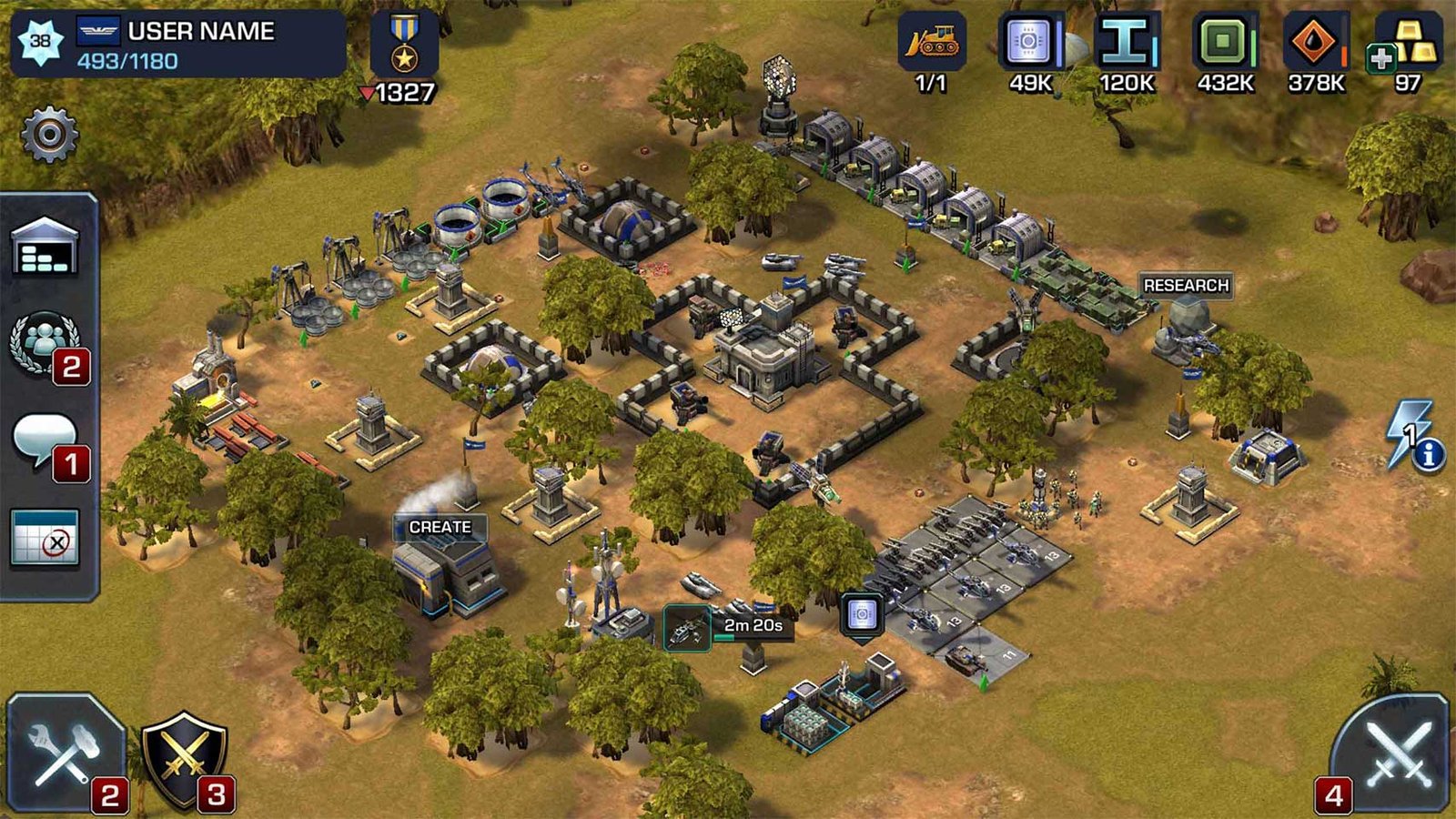
Here you can see screenshots of the game when it launched, and another screenshot of the game 1 year later.
I wish I could say the above screenshot was a joke, but this was the actual state of the game when I joined the team.
The UI had completely take over, and the edge of the screen was fully filled with buttons for features that had been added since the game launched. The team was no longer able to add new features because there simply wasn’t anymore space to put them.
These types of problems can easily happen when you don’t have a dedicated person with a plan for growth.
The plan previously was to place new content where there was empty space. Obviously that is not a scale-able solution.
Identifying the problems
As you can see the UI has completely taken over the screen.
Every button blends into the next without any logical order. There are too many icons on the screen without any visual cues as to their functionality.
Forcing users to remember all of the icons, location and functionality becomes a huge mental load for users, and a huge barrier to entry for new users.
Choosing the correct solution:
I could easily start from scratch, and completely redesigning all of the games systems and it would look great. But of course this wold be a very bad choice on my part. This game despite its poor UX had a very large user-base who had learned all of the games iconography and flows. Redesigning everything from scratch, even though much better, would alienate existing users and would require reteaching them all of the new UX flows.
The challenge here was to keep the games base functionality but bring order to the flows and create a scale-able system for growth.
My Process:
The first steps I take to solve this complex problem is to simplify.
I start by categorizing the features by type. Then I prioritize the categories by level of importance for the user.
I ask key questions. What is the users motivations on this page?
What is the most important and what is least important?
Redesign:
Here is the redesigned UI. The solution to the clutter was to have each feature categorized by type, and secondary information in a category tab.
For example: Chat, Team Chat, and Alliance Chat all live under a SOCIAL slide out category.
Global Battle, Alliance Battle, Quick Battle now live in a BATTLE radial menu.
Conclusion:
After extensive user testing with high level players, play tests with new users, and community feedback, the result is a usable and scale-able solution. On this project it was important to use the same visual language that existing users understood, and also had a solid plan for future content. The result was positively received by all and continues to be at the top of the app charts.


